Wireframing: Rules of Thumb

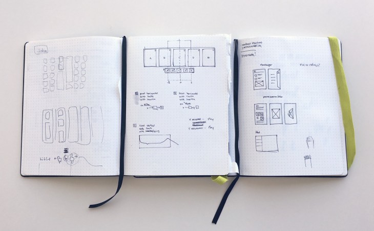
A wireframe is a visual representation or a mockup of an interface using only simple shapes. They’re void of any design elements such as colors, fonts or images and they’re used to communicate ideas and represent the layout of a website in the early stages of a project.

They are usually done before the design phase commencement to get the business approval on the structure of the design itself.

It is important that:

  • žElements on the page have a good aspect ratio for the content they contain.  ž
  • The white-space should give elements room to breathe, and should never  be so large that connected elements get lost. ž
  • If the  more than one header is shown, the headers adding  relevant information should be large, whilst others should be either small (e.g. where the header is mostly implied by the content) or omitted (where the header is completely implied by the content). ž
  • Vertical space is used wisely.
  • žAs a rule of thumb, multi-line text and headers that repeat down the page should be left justified. Lone lines can be centered. With tabular data and forms, the left column can be right justified.
  • žTo Avoid: ž
    • Extraneous lines & ‘chartjunk’ ž
    • Unnecessarily repeated elements on the same page.
    • žInconsistent layout choices.
    • žInformation of minimal relevance to common tasks.
Advertisement

User Experience Research: Evaluation

Usability Evaluation assesses the extent to which an interactive system is easy and pleasant to use.

It is generally defined as:
  • Formative evaluation: when conducted early on in the design process with low fidelity prototypes – this evaluation required the designer to collect the data (e.g. time to complete the task, clicks, etc…).
  •  Summative evaluation: when conducted with high fidelity prototypes or a near final interface – this evaluation might produce data on how the user interacted with the system (e.g. log data)
The type of prototype affects the environment where the testing takes place:
  • Low fidelity prototypes require testing in a controlled environment (e.g. a lab)
  • High Fidelity prototype can be tested in the wild (e.g. the user’s phone or a kiosk)
A thorough evaluation requires that we consider if the design is usable. This means that we measure to what degree the goals of the task are met. This can be accomplished by collecting quantitative data in the form of questionnaires, or log data of the path the user traversed while completing the task. Or it can be qualitative data in the form of user interviews.

We will be able to ascertain if the design is efficient by evaluating various task completion measures. These include time to completion of the task, number of clicks, or number of errors while performing a task.

Notice that we can infer learnability and memorability by using some of the same measures I just mentioned.

Learnability refers to how easy it is to complete a task successfully. We can get an objective measure of this by looking at the data for number of clicks to complete a task, or amount of time to complete a task, and then compare these to expert performance.

Memorability refers to how easy it is to remember how to use a product, or more specifically, how to perform a given task on an interface after repeated trials.

We can measure amount of time or number of clicks to complete a task over repeated trials to get a measure of memorability.

We also need to have indicators of the subjective user satisfaction while executing the task.

These can be both cognitive or emotional aspects of the task completion. We are going to refer to cognitive measures as those that relate to the mental effort it required to complete the task. For example, were the steps required to complete the task intuitive?

For the emotional component, we want to have a sense of the feelings that the user experienced as she completed the task. These two might be correlated. It might be that a task that was unintuitive will lead to the user feeling frustrated.

Here’s a sample of the kind of data matrix you might collect after a usability session. This is not exhaustive. It’s just an example.

It’s important to remember that the usability measures we just discussed must be considered in relation to either the values rate using the status quo interface, right, the current practices of the user.

Or if were designing a completely new interaction, we can compare the user’s values to some other objective measures of success. For example, the values that are obtained when the design team, you might consider these people experts, use a novel design.

Advance evaluation techniques are:

  1. Heuristic Evaluation
  2. Cognitive walk trough

Once the evaluation data is collected and analyzed, the designer is in a position to iterate on the design. This may lead to another round of alternative designs. It might lead to prototype building and more evaluation. When do you stop? Well, one rule of thumb is that you stop when you have met your design objectives. And this translates to an evaluation cycle that shows that the user can interact with your design in an effortless and enjoyable manner.

To learn more, check on:

Usability Evaluation 101 by Usability.Gov

Interaction Design – Chapter 15 – Usability Evaluation.

WQUsability – More than Easy to use.

Measuring Usability: Are Effectiveness, Efficiency, and Satisfaction Really Correlated? by CHI 2000.

Usability 101 – Introduction to Usability – by Nielsen Norman Group

How to generate product ideas: a practical example

Opportunity Statement

Teenagers who like to sleep in late need an easy way to eat breakfast on the go because they don’t have time to eat breakfast before leaving their home and yet breakfast is the most important meal of the day.”


First list as many ideas cross your mind

Listing ideas

  1. Healthy smoothie hold the backpack/car/scooter/etc… drinking holder.
  2. Breakfast bars that attached to the phone arm holder.
  3. Frozen nutty fruits licorice sticks to be consumed on the go.
  4. Yogurt easily resealable with a stick attached.
  5. Granola in a top zip bag easy mixer.


Then, remove any physical constraint limiting the flow of ideas.

Eliminating a constraint

The teens consume breakfast by themselves at home.

  1. Mini muffin sandwiches in a top zip bag for easy sharing.
  2. Mini sharer plate for bus/car consumption (with friends).
  3. Music food-box container with the latest hits for impromptu parties.
  4. Friends-sharing application for a healthy lifestyle (exercise counts, calories counts, track of eating habit).
  5. VR Breakfast Go app.


Then, make an association with any event related to the target audience.

Make an analogy

If eating breakfast on the go was like having a fun party.

  1. Bright colorful breakfast food and drinks.
  2. Carillon type food boxes.
  3. Friends having breakfast together at each home on rotation.
  4. Friends bringing breakfast food to share.
  5. Theme breakfast parties on the go.


Then, go for the maximum.

Exaggerate

Teenagers need to eat 10 apples every morning for breakfast to be healthy

  1. Large apple juice made of 10 apples.
  2. An apple pie to be eaten daily.
  3. 10 apple/peanut butters sandwiches.
  4. A 10 apples waist holder for an easy eat on a go.
  5. A waist that includes holders for: a. A medium juice cup; B. An apple/peanut butter sandwich; C. an apple pie slice.


Is the writer block still impacting your flow of ideas? Then list those you will never recommend.

Get in the garbage

  1. Breakfast electronic dispenser in the teen’s room.
  2. Breakfast’s substitute energy pills.
  3. Gwyneth Paltrow style daily £400 energy smooth.
  4. Music cup that activates on drinking.
  5. Kick-off bed to ensure the teen is not late.


Finally, select the best idea based on well determined criteria.

Most useful idea

Healthy smoothie hold the backpack/car/scooter/etc… drinking holder – it uses existing gadgets, no risk for spilling the content, easy to prepare, fast to consume, full of healthy benefits.


Most Desirable idea

VR Breakfast GO app – apart from encouraging kids having breakfast by sharing their experience online with friends, it could promote a healthier lifestyle by imitation – e.g. advocating walking to school, additional activities, healthy breakfast/lunch/dinner/…  


Easiest Idea

The mini sharer plate for easy consumption with friends – almost every household has a sharer plate, alternately buying one is not expensive. Sharing breakfast with friends should improve the overall experience.


Most functional

Breakfast bars that attached to the phone arm holder – because it uses the unexplored and hidden functionality of an existing gadget.


Most Sustainable idea

Frozen nutty fruits licorice sticks to be consumed on the go – no waste produced, all are eatable pieces.
Other prototyping techniques

Other prototyping techniques that do not fit into the definition of High or Low fidelity categories are:

    1. Wizard of Oz technique:  Used to model/mimic functionality of a product by having a human perform the  task usually performed by the computer. The user is unaware that the product is not functional. Usually the “wizard” sits in a back room, observes the user’s actions, and simulates the system’s responses in real-time. For input device testing the “wizard” will typically watch live video feeds from cameras trained on the participant’s hand(s), and simulate the effects of the observed manipulations. Often users are unaware (until after the experiment) that the system was not real.

Advantages:

      • Saves time and money when compared to building a functional system.

Disadvantages:

        • Setting the stage time.
        • Required multiple well trained people
        • The user might then have unrealistic expectations.

http://www.usabilitynet.org/tools/wizard.htm

Proof of Concept Video Technique:  fictional video that shows a “working system” in a variety of scenarios.


Metaphor Technique: is meant to help the user build a relevant mental model of how a new design functions. The metaphor communicates the functionality of the novel design compared to systems that the user already knows and is familiar with.

Low Fidelity Prototypes notes

Low Fidelity Prototypes include:

  1. Sketching;
  2. Storyboard;
  3.  Card-Based.

Sketching – is a free-hand depiction of images related to the final design.

sketching

Storyboards – are common way to provide a narrative putting the design into context. It provides an opportunity to see how the user will engage with a given scenario. The below storyboard is from RuoCheng.me.

storyboarding_ruocheng

Card-Based prototype –  allows us to see at the sequence of iterations the user might have with the designed interface.

ukbcgphff-cvyivijmnuka_m


Resources:

Usability.com/Prototyping – includes an excellent graph by Tracy Lepore visually showing the evolution from sketch to design.

Lo-Fi vs. Hi-Fi Prototyping: how real does the real thing have to be? by  Florian N. Egger on telenovo.com.

High-Fidelity vs. Low-Fidelity prototyping in Web Design and App Development – by Kim Doleatto on http://www.atlargeinc.com/

Tools:

UX Recorder – Good for mobile user testing on iOS

Invision – Free design prototyping tool

Marvel App – Free version – prototyping tool for all type of devices.

Azure – the most used software.


Resources for Requirement Gathering

  1. Personal Excellence – 25 Useful Brainstorming Techniques

  2. Leading Answers – Non Functional Requirements: minimal checklist.

  3. SearchSoftwareQuality – Differentiating between Functional and Non Functional Requirements.

  4. Usability First – Facilitated Brainstorming.

  5. Above the fold design – 5 Powerful ways to brainstorming with teams.

  6. Inspire UX – Tips for Structuring better brainstorming sessions.

  7. Jessica Ivins – Collaborative Brainstorming for better UX

  8. ASQ – Affinity Diagram

  9. Mind Tools – Affinity Diagrams.

  10. Info Design – Affinity Diagramming.