Wireframing: Rules of Thumb

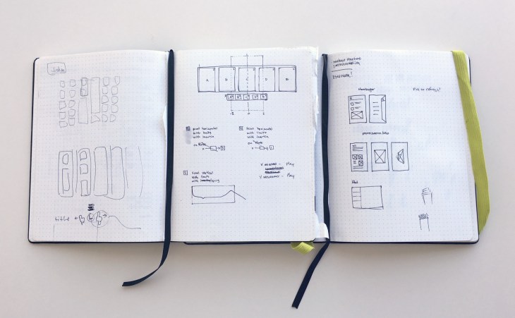
A wireframe is a visual representation or a mockup of an interface using only simple shapes. They’re void of any design elements such as colors, fonts or images and they’re used to communicate ideas and represent the layout of a website in the early stages of a project.

They are usually done before the design phase commencement to get the business approval on the structure of the design itself.

It is important that:

  • žElements on the page have a good aspect ratio for the content they contain.  ž
  • The white-space should give elements room to breathe, and should never  be so large that connected elements get lost. ž
  • If the  more than one header is shown, the headers adding  relevant information should be large, whilst others should be either small (e.g. where the header is mostly implied by the content) or omitted (where the header is completely implied by the content). ž
  • Vertical space is used wisely.
  • žAs a rule of thumb, multi-line text and headers that repeat down the page should be left justified. Lone lines can be centered. With tabular data and forms, the left column can be right justified.
  • žTo Avoid: ž
    • Extraneous lines & ‘chartjunk’ ž
    • Unnecessarily repeated elements on the same page.
    • žInconsistent layout choices.
    • žInformation of minimal relevance to common tasks.
Advertisement

User Experience Research: Evaluation

Usability Evaluation assesses the extent to which an interactive system is easy and pleasant to use.

It is generally defined as:
  • Formative evaluation: when conducted early on in the design process with low fidelity prototypes – this evaluation required the designer to collect the data (e.g. time to complete the task, clicks, etc…).
  •  Summative evaluation: when conducted with high fidelity prototypes or a near final interface – this evaluation might produce data on how the user interacted with the system (e.g. log data)
The type of prototype affects the environment where the testing takes place:
  • Low fidelity prototypes require testing in a controlled environment (e.g. a lab)
  • High Fidelity prototype can be tested in the wild (e.g. the user’s phone or a kiosk)
A thorough evaluation requires that we consider if the design is usable. This means that we measure to what degree the goals of the task are met. This can be accomplished by collecting quantitative data in the form of questionnaires, or log data of the path the user traversed while completing the task. Or it can be qualitative data in the form of user interviews.

We will be able to ascertain if the design is efficient by evaluating various task completion measures. These include time to completion of the task, number of clicks, or number of errors while performing a task.

Notice that we can infer learnability and memorability by using some of the same measures I just mentioned.

Learnability refers to how easy it is to complete a task successfully. We can get an objective measure of this by looking at the data for number of clicks to complete a task, or amount of time to complete a task, and then compare these to expert performance.

Memorability refers to how easy it is to remember how to use a product, or more specifically, how to perform a given task on an interface after repeated trials.

We can measure amount of time or number of clicks to complete a task over repeated trials to get a measure of memorability.

We also need to have indicators of the subjective user satisfaction while executing the task.

These can be both cognitive or emotional aspects of the task completion. We are going to refer to cognitive measures as those that relate to the mental effort it required to complete the task. For example, were the steps required to complete the task intuitive?

For the emotional component, we want to have a sense of the feelings that the user experienced as she completed the task. These two might be correlated. It might be that a task that was unintuitive will lead to the user feeling frustrated.

Here’s a sample of the kind of data matrix you might collect after a usability session. This is not exhaustive. It’s just an example.

It’s important to remember that the usability measures we just discussed must be considered in relation to either the values rate using the status quo interface, right, the current practices of the user.

Or if were designing a completely new interaction, we can compare the user’s values to some other objective measures of success. For example, the values that are obtained when the design team, you might consider these people experts, use a novel design.

Advance evaluation techniques are:

  1. Heuristic Evaluation
  2. Cognitive walk trough

Once the evaluation data is collected and analyzed, the designer is in a position to iterate on the design. This may lead to another round of alternative designs. It might lead to prototype building and more evaluation. When do you stop? Well, one rule of thumb is that you stop when you have met your design objectives. And this translates to an evaluation cycle that shows that the user can interact with your design in an effortless and enjoyable manner.

To learn more, check on:

Usability Evaluation 101 by Usability.Gov

Interaction Design – Chapter 15 – Usability Evaluation.

WQUsability – More than Easy to use.

Measuring Usability: Are Effectiveness, Efficiency, and Satisfaction Really Correlated? by CHI 2000.

Usability 101 – Introduction to Usability – by Nielsen Norman Group

Low Fidelity Prototypes notes

Low Fidelity Prototypes include:

  1. Sketching;
  2. Storyboard;
  3.  Card-Based.

Sketching – is a free-hand depiction of images related to the final design.

sketching

Storyboards – are common way to provide a narrative putting the design into context. It provides an opportunity to see how the user will engage with a given scenario. The below storyboard is from RuoCheng.me.

storyboarding_ruocheng

Card-Based prototype –  allows us to see at the sequence of iterations the user might have with the designed interface.

ukbcgphff-cvyivijmnuka_m


Resources:

Usability.com/Prototyping – includes an excellent graph by Tracy Lepore visually showing the evolution from sketch to design.

Lo-Fi vs. Hi-Fi Prototyping: how real does the real thing have to be? by  Florian N. Egger on telenovo.com.

High-Fidelity vs. Low-Fidelity prototyping in Web Design and App Development – by Kim Doleatto on http://www.atlargeinc.com/

Tools:

UX Recorder – Good for mobile user testing on iOS

Invision – Free design prototyping tool

Marvel App – Free version – prototyping tool for all type of devices.

Azure – the most used software.


Resources for Requirement Gathering

  1. Personal Excellence – 25 Useful Brainstorming Techniques

  2. Leading Answers – Non Functional Requirements: minimal checklist.

  3. SearchSoftwareQuality – Differentiating between Functional and Non Functional Requirements.

  4. Usability First – Facilitated Brainstorming.

  5. Above the fold design – 5 Powerful ways to brainstorming with teams.

  6. Inspire UX – Tips for Structuring better brainstorming sessions.

  7. Jessica Ivins – Collaborative Brainstorming for better UX

  8. ASQ – Affinity Diagram

  9. Mind Tools – Affinity Diagrams.

  10. Info Design – Affinity Diagramming.

Moments of truth vs. Micro-Moments

Moments of Truth  is a Journey mapping term, and can occur outside of the digital experience. An example being opening the front door of a shop and walking in for the first very time.


Micro-Moments is a phrase coined by Google. They are rooted in the mobile experience: primarily grab the smartphone moments where a person seeks for answers, information, or tries to complete a task via digital.

SEO: On Page Optimization

Let’s start with two SEO myth: meta keywords are death and should not be used.  Next, an heavy meta keywords optimized site is counterproductive for your ranking since the latest Google Penguin release. There are in fact rumors that also Bing used them to determine whether a site is a spam or a genuine site.

On the contrary, meta descriptions are crucial: they appear in the search results as the snippet description of the website/page.  Each page should have its unique meta description: search engine consider duplicate tattle tags or meta description as bad form and can actually penalize the page.

If you have a responsive website, duplicate content displayed on across devices is a serious issue.  Google recommend to add a canonical tags to all mobile optimized page, and an alternate tags to the respective web site pages. In this way, its search engine will easily determine and show the device-optimized page to the user client. You can also use canonical tags to discriminate yours  from a partner’s content.

In recent time, rich snippets that enables the site to embellish their search results with add-ons, such as customer’s ratings have gained popularity. Although it is still unclear how they might affect your website ranking on search engine, recent studies prove that a user is more likely to engage with sites that have richest snippets.

Last but not least, you can claim Google authorship by linking you site with your Google + account.


GOGGLE BING
Meta Description 155 characters 165 characters
Meta Title 62 Characters 57 Characters

How to analyse the Usability testing Findings

At the end of each usability testing, you will collect several types of data, and report the finding in a spreadsheet as in the example below, where each response is ranked based on the calculated KPIs: (1) Success rates; (2) Task time; (3) Error rates; and (4) Satisfaction.

In example, you can use the following scale to report your findings, where you assign a value of: (1) 0 for all failed task; (2) 1 for all task that are successfully completed  within 1 to 2 minutes; (1) 2 for all task that are successfully completed in 1 minute.

ANALYZING THE USABILITY TESTING RESULTS

  Segment 1 Segment 2   Segment n Avg. Response by Question
Question 1         Avg. Q1
Question 2         Avg. Q2
           
Question n         Avg. Q4
Average Response by Segment Avg Seg. 1 Avg Seg. 2   Avg Seg. N  

As you are reviewing the data, it is extremely important to highlight and prioritize any detected usability issue. To help differentiate, you should note the severity of the problems on a scale points as defined below:

REPORTING SEVERITY LEVELS OF PROBLEMS
Critical This would mean severe business and usability impact. This is a showstopper: the user is unable to complete the task.
High This would mean a significant business and usability impact, but not necessary a showstopper: some users will be frustrated if the issue is not fixed. It is not a showstopper if the affected user segment has no, or low value for the business
Medium This would mean a potential business and usability impact. More impact analyse is needed. Not a showstopper.
Low This would mean there is no an immediate business and usability impact. The users are annoyed, but this doesn’t keep them from completing the task

Your report should include your recommendations and UX/Business/Technological impact. Below the minimum required points:

RECOMMANDATIONS
UX IMPACT
BUSINESS IMPACT
DEVELOPMENT IMPACT
FINAL RECOMMANDATIONS
Provide user acknowledge form after submitting the form H L Easy to fix Fix this issue in the current release
Redesign the Event section L H Time consuming task, not in the spring budget Fix this issue in the next available release


A selection of templates to be used for your reporting can be found at:

www.usability.gov/how-to-and-tools/resources/templates.html


Types of Usability Tests

Formative Testing

Formative testing is usually conducted during website development and is typically used to test a specific feature like the design of a button or the findability of a piece of specific content, etc…

For example: is the user able to find the email form and be able to subscribe to the newsletter? Or is the user able to find a piece of content given the labeling of the button?


Summative Testing

Summative testing is conducted at the end of the development, the “Summation” of the development process. Summative testing is used to determine whether a website has successfully accomplished all of its goals.


Qualitative vs. Quantitative Testing

Related to, measuring, or measured by the quantity/quality of something rather than its quality/quantity.